Most UX case studies show one redesigned screen and one convenient metric. Real transformations rarely work that way — they're a sequence of smaller, individually tested fixes across an entire shopping journey, each measured on its own terms. Over roughly a year, UniKwan's team worked with a leading watch and accessories e-commerce brand to rebuild that journey stage by stage: how products are discovered, how a product page builds buying confidence, how the primary purchase action is designed, how checkout gets completed, how recommendations surface, and how many taps simply fail along the way.
Table of Content
- What was the problem with the original e-commerce experience?
- How did UniKwan improve product discovery on the listing page?
- How did the product page improve the purchase decision?
- How did the CTA redesign affect conversion and average order value?
- How did UniKwan improve the checkout experience?
- How did behaviour-based recommendations improve the shopping journey?
- How did UniKwan identify and fix clicks that went nowhere?
- What did the full-funnel UX transformation add up to?
- What does this mean for your own e-commerce funnel?
- What's the key takeaway?
- Frequently Asked Questions (FAQs)
Where it started: a functional platform but not an engaging one
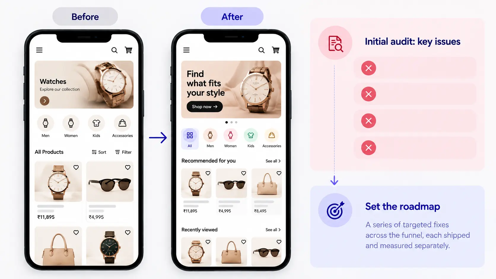
The brand's core issue wasn't broken functionality — everything worked. The problem was that the experience stopped there. UniKwan's initial audit described a transactional journey with low engagement around key actions, weak product discovery, an interface that was functional but emotionally flat, and limited personalization. That diagnosis set the roadmap for everything that followed: not one redesign, but a series of targeted fixes across the funnel, each shipped and measured separately.
Fixing discovery on the listing page
The first work centered on how people browse before they ever open a product. Sort and filter controls were moved lower on the screen for easier thumb reach on mobile, and a sticky filter bar kept them accessible while scrolling instead of disappearing off-screen. A "get within 48 hours" delivery highlight was surfaced to speed up decisions, and gender-specific filters — men's, women's, kids' — were made accessible upfront instead of requiring a detour into a separate section.
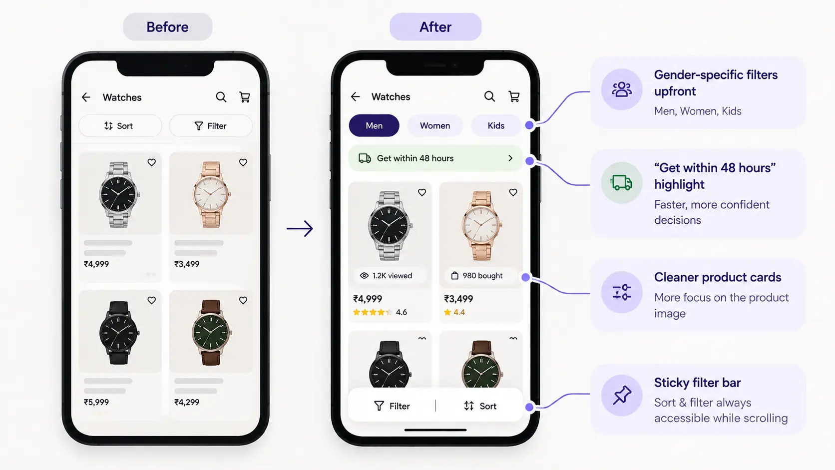
"If you give users a lot of choice, it becomes more confusing for them rather than helping them. We looked at which filters people actually used, and a small handful came up again and again — so we brought exactly those forward instead of leaving them buried in a filter panel."
— Md Suban Anwar, UI/UX Designer, UniKwan
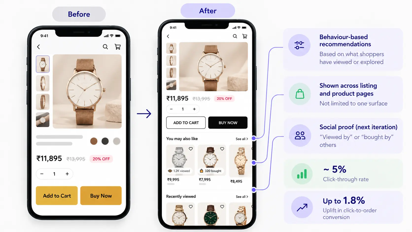
The listing-page work also touched the product card itself: promotional badges and pricing that previously sat directly over the product photo were moved below it, giving the image room to breathe, with lightweight social-proof cues (recent view and purchase counts) added to build trust in the moment someone was deciding whether to click through.
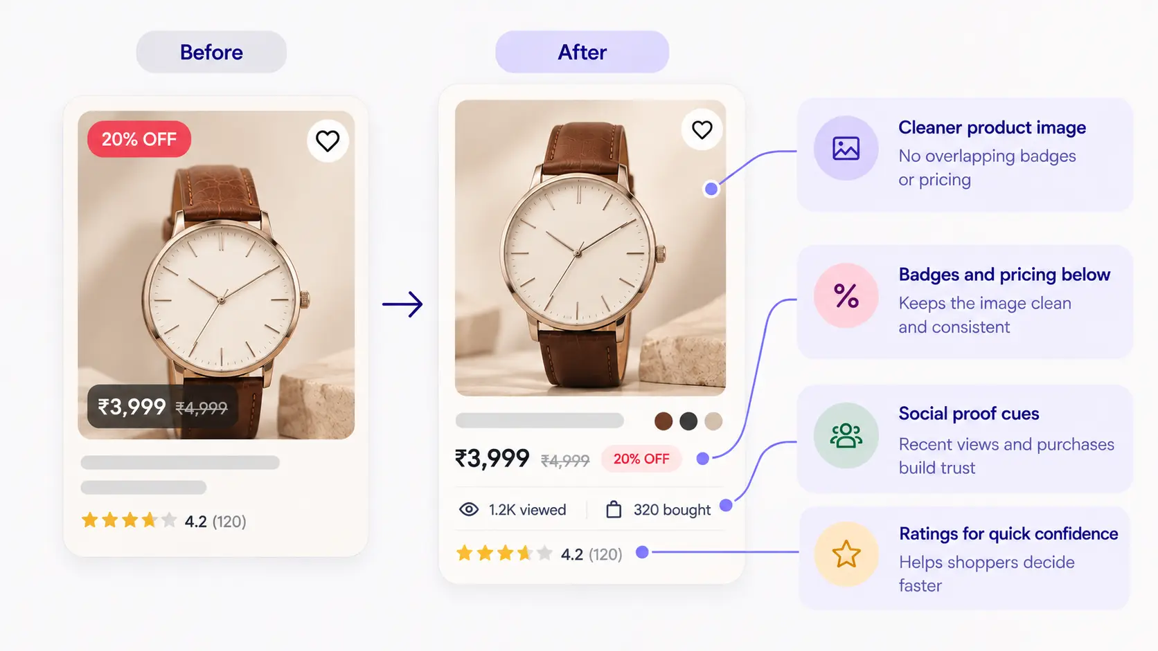
"Most users come to the listing page focused on two things — the image and the price. So, we let the image breathe. We also added small social-proof signals, like how many people viewed or bought a product recently, because that builds trust right at the point someone's deciding whether to click through."
— Md Suban Anwar, UI/UX Designer, UniKwan
This stage of work was measured qualitatively rather than against a single conversion number: faster browsing with less effort, better mobile accessibility, more interaction with filters, and clearer delivery expectations, based on UniKwan's post-launch assessment.
Making the product page do more of the persuading
Rather than a full rebuild, the product page kept its existing content but reorganized it for faster scanning and clearer decision-making — pulling the details shoppers actually needed higher up the page. Implemented in December 2025, with results tracked through March 2026, this single change moved product-page revenue up 9%, lifted average order value from ₹4,649 to ₹5,016 (an 8% increase), and was associated with a reported buyer-confidence score of 97%.
A CTA redesign proven by A/B testing
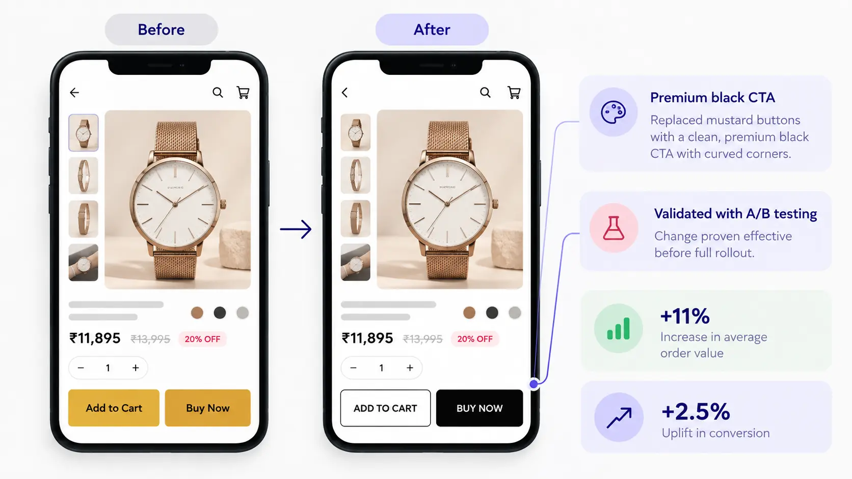
The primary purchase button — "Add to Cart" and "Buy Now" — was restyled from a mustard button to a premium black CTA with curved corners; a change validated through A/B testing before it rolled out fully. It was associated with an 11% lift in average order value and a 2.5% uplift in conversion.
Smoothing the path through checkout
Even with a stronger product page and CTA, checkout was where a meaningful share of purchase intent simply stalled. The fix was mostly subtraction: fewer unnecessary steps, a more focused layout guiding shoppers toward completing the purchase, and reassurance messaging built into the loading state, so people weren't left wondering if anything had happened. Checkout-to-order conversion moved from 16.76% to 28.08% — nearly doubling the share of shoppers who reached checkout and completed the purchase.
Recommendations that follow the shopper
Behaviour-based product recommendations, built from what a shopper had actually viewed or explored, were added across both the listing and product pages rather than confined to one surface. A social-proof layer — "viewed by" or "bought by" others — is planned as a next iteration. Implemented in January 2026 and measured through March 2026, the feature drove a click-through rate of roughly 5% and lifted click-to-order conversion by up to 1.8%.
Killing the clicks that went nowhere
Alongside the visible redesign work, UniKwan's team also tracked something shoppers never see but definitely feel: clicks that failed to do anything. "Add to Cart" error clicks fell from 9% to 1% — an 88% reduction — and "Buy Now" error clicks dropped by the same margin. On the payment page, dead clicks on "Continue to Payment" fell from 34% to under 1%, a 97% reduction. These fixes shipped in November 2025, driven by product-page performance optimization, faster API responses, clearer press-state feedback on buttons, loader performance improvements, and payment-flow bug fixes.
What it added up to
Across the engagement, the brand's digital revenue grew 24% year-over-year.
| Initiative | Metric | Result |
|---|---|---|
| Product page (PDP) | Revenue / AOV | +9% revenue, AOV ₹4,649–₹5,016 (+8%) |
| CTA redesign | AOV / Conversion | +11% AOV, +2.5% conversion |
| Checkout flow | Checkout-to-order | 16.76% → 28.08% |
| Recommendations | CTR / Conversion | ~5% CTR, up to +1.8% conversion |
| Error-click fixes | Error / dead clicks | -88% (cart, buy now), -97% (payment) |
| Overall | Digital revenue (YoY) | +24% |
What this means for your own funnel
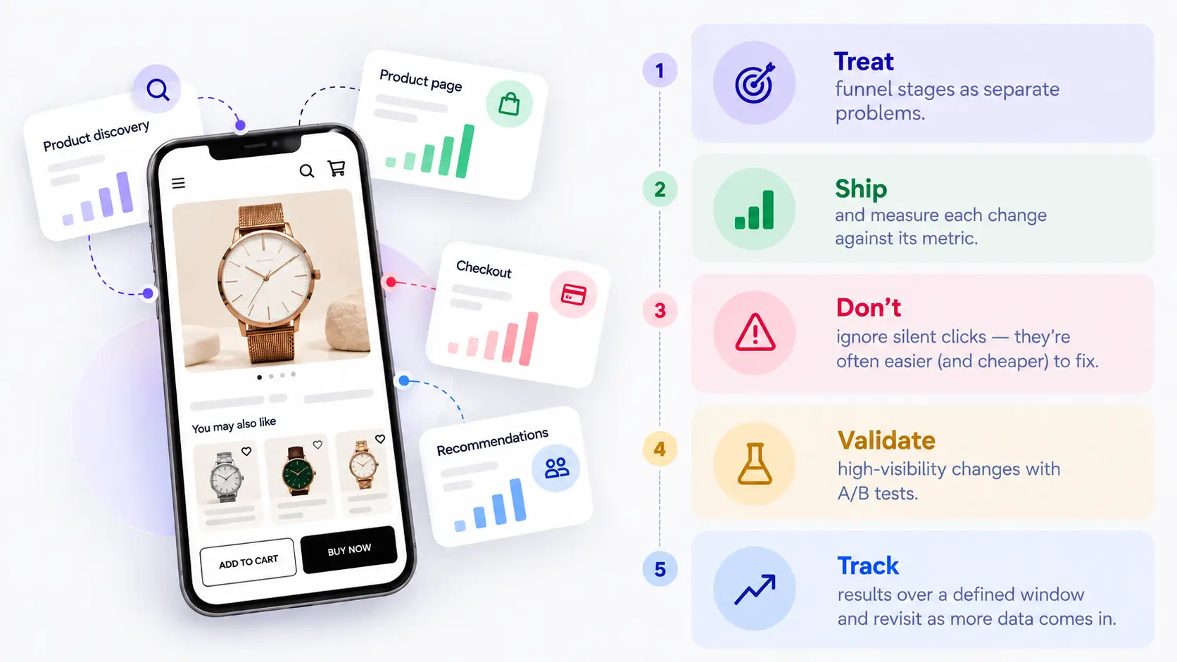
- Treat funnel stages as separate problems — a listing-page fix and a checkout fix need different diagnoses and different metrics.
- Ship and measure each change against the specific metric it targets.
- Don't ignore clicks that fail silently — error and dead-click rates are often cheaper to fix than a full redesign, and the payoff can be just as large.
- Validate high-visibility changes like CTA styling with A/B tests before rolling them out platform-wide.
- Track results over a defined window per initiative and revisit the numbers as more data comes in rather than reporting them once and moving on.
Key takeaway
A funnel doesn't improve because of one big redesign — it improves because every stage of it is measured, fixed, and re-measured. If your platform has pockets of friction you haven't quantified yet, that's the first thing worth finding before any redesign work starts.
UniKwan runs this kind of funnel-first UX work for enterprise and DTC product teams. You can explore more of our ecommerce and product design work in our project portfolio — including our ecommerce UX work with Fastrack, or browse our full range of UX design expertise. Get in touch at info@unikwan.com to talk through a funnel audit for your own platform.
Frequently Asked Questions (FAQs)
Q1. What is a full-funnel ecommerce UX transformation?
A full-funnel ecommerce UX transformation looks at the entire shopping journey, from product discovery and listing pages to product pages, purchase CTAs, checkout and recommendations. In this case study, UniKwan addressed each stage through targeted UX improvements rather than treating the experience as a single redesign.
Q2. What ecommerce UX improvements did UniKwan make?
UniKwan improved product discovery on the listing page, reworked product cards, strengthened product-page persuasion, redesigned the primary purchase CTAs, streamlined checkout, introduced behaviour-based recommendations and fixed clicks that were not leading to the intended action.
Q3. How did the ecommerce UX changes affect conversion and revenue?
The changes produced measurable improvements across different parts of the funnel. The CTA redesign was associated with an 11% increase in average order value and a 2.5% increase in conversion, while overall digital revenue increased 24% year over year. The case study also reports improvements in checkout-to-order conversion and recommendation-driven conversion.
Q4. Why is it important to measure ecommerce UX changes separately?
Different stages of an ecommerce funnel have different user behaviours and business metrics. The case study recommends shipping and measuring each change against a specific metric rather than evaluating the entire funnel as one problem. This makes it easier to identify what is working and where further optimisation is needed.
Q5. Does ecommerce UX optimisation always require a complete website redesign?
Not necessarily. This case study used a series of targeted fixes across the funnel rather than one large redesign. Changes were identified, shipped and measured separately, showing how specific friction points can be addressed without redesigning the entire ecommerce experience at once.
Share



Growth Marketing & Operations